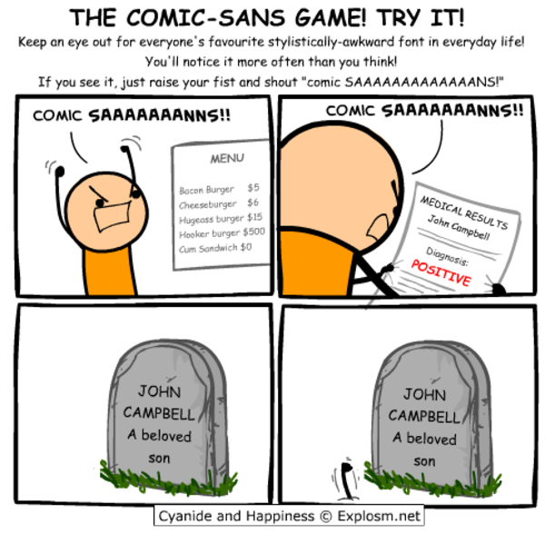
Seriously, though, Comic Sans was originally designed to be legible at the smallest possible font size, and the lack of hard lines makes it easier to read!
Friendship ended with font gatekeeping and dogpiling, accessibility is my new best friend
Look what you have done! I used Operator Mono for Italics. I kind of like this!
bro… how did you manage to stain a screenshot
Is it that bad? Now I have IBM Plex installed
Oh no now I want to build a whole Arch rice around that font.
…no that’s not enough.
we need ComicSansOS
Holy man! If you ever do that. Please post! On unix porn as well!
Does it support ligatures??
I…don’t hate it? Why am I not horribly offended by this?
I feel the same way. I hate that Iike it and am now going to try it.
I’m intrigued, but it feels so wrong
I am in the same boat. Installing…Dog help me.
As long as it’s a monospaced font I don’t really care what the font is. (Wingdings excluded)
Might give it a try for a day.
I tried using Comic Mono for coding once after seeing this video about Comic Code. Honestly it was a pretty good experience.
Blatant trolling should be banned! Get the pitchforks everyone! :P
If you like that, check out Recursive Sans & Mono
I wouldn’t pick it over Fira Code but it has a bit of whimsy to it that reminds me of Comic Mono.
I will forever believe the comic sans hate is one of the internet’s seemingly random circlejerks, like hating Imagine Dragons.
There were legitimate reasons from a design standpoint. It’s badly balanced, the spacing is inconsistent…and it was everywhere.
Funny enough, I suspect what makes it a badly designed font might be why some people with dyslexia have an easier time reading with it. The badly balanced, poor spacing, probably made the letters in the font more distinguishable from one another.
If you (or anyone else that’s interested) have the time, I think this article, “Why You Hate Comic Sans,” goes over all of it pretty well.
I recently read a review of 1990s pop aesthetics, and it was probably intentional for reasons that resonate with us again. In the 90s, with the advent of omnipresent computers, organic, amateurish handwriting became really popular, and I think that’s what comic sans is good at looking like.
⚠️ I have reported this post to the proper authorities.
Title is misleading, it’s a monospaced derivative of Comic Sans that’s actually nice, not actual Conic Sans.
Conic Sans is the hyperbolic version of Comic Sans
I miss RES’s context feature now. Thank god this thread wasn’t too long, so I was able to find my comment you replied to in it in a reasonable amount of time.
I was addicted to coding with Comic Mono and ended up purchasing Comic Code. No regrets.
I mean Comic Mono is mentally relaxing and legible so great font of choice