- cross-posted to:
- technology@lemmy.world
- cross-posted to:
- technology@lemmy.world
You must log in or register to comment.
The US State Department only just directed its employees to use Calibri for memos earlier this year. The State Department had been using Times New Roman instead since 2004.
Lmao
Honestly, they have probably kept times new Roman for other things, as a serif font it’s much harder to make the mistake between a capital I and a lower case l.
Ambiguity can cause problems.
At the same time, I agree, lmao.
L agree?
I my ass off?
This Guy Gets It, Or Does He Get lt?
Efficacy of prehospital administration of fibrinogen concentrate in trauma patients bleeding or presumed to bleed (FIinTIC)
deleted by creator
How is a new font “more inclusive”? This word has been co-opted by corpo drones and has lost its meaning.
It’s little things like better disambiguation between uppercase i and lowercase L.
and the letters qpdb are different? (for dyslexic people)
qpdb are completely symmetrical in Bierstadt, so no.
It’s like ‘gaslighting’ or ‘reboot’, or various others: it gains a little traction then everyone finds an excuse to use it, appropriate or not.
The only meaning I could imagine as useful is to include more different scripts from the Unicode set.
Looks like a return to Arial to me!
Meanwhile professors still be requiring essays done in Times New Roman, and all actual documents are done in the default because as long as its legible it doesn’t matter.
Oh except for a court case in 2044 when a lawyer notices “Aha! This document is dated from 2020 but the Aptos font wasn’t introduced until 2023, this document is forged!” Yes I can cite precedent, Your Honor; something similar happened with Callibri, introduced circa 2007.
Well it already happened https://www.theverge.com/2017/7/12/15961354/pakistan-calibri-font-scandal-forged-documents
See? Told you there was precedent.
Thanks for the sauce, that makes me so happy, people like me have them Sherlock skills, being heroes
Meanwhile professors still be requiring essays done in Times New Roma
A font I strongly dislike. Particularly in any electronic media it just looks unsightly to me for some reason I have never been able to articulate. I do tend to like sans-serif fonts more in general, but I don’t think that’s entirely it.
I hope to never return to an environment where someone is going to complain about just using Arial or similar.
Remindme! 7-14-2044 GOOD KERNING MATTERS
Previously known as Bierstadt
Missed opportunity. Long live Beertown! 🍻
Again? I still haven’t gotten over the switchover from Times New Roman to Calibri.
Found the US State Department.
i wish we could collectively agree to switch to Liberation Mono and stay there
I like Tahoma
This is at least the 4th official microsoft font I’ve been around for. What a time to be alive!
DAE hate Calibri?
Yup
Hate would be a too strong word, but I’ve disliked it always. Much prefer Arial or even Verdana.
I guess I’m the only one here who likes it
Good to know. I’ll get ready for some user to complain about this today.
Wow, all these essential moves like azure ad to entra id and a new default font?
microsoft has be laying off the wrong people.
Why didn’t they just use Segoe UI? It’s a really nice font.
Segoe is so good. Criminally underrated.
It’s honestly one of my favorite all purpose fonts, very clean, but has much more personality than other san-serif fonts like Helvetia or Noto.
It does, but because of that I feel it needs to be used a bit more sparingly. Helvetica (Neue) you can use the entire document; Segoe seems like it works best for headings and such, but maybe I’m wrong and someone does it well.
I’ve been using this font in my stuff for years.
As an avowed Calibri hater, thank fuck.
Well at least it’s not Comic Sans.
Aptos is a part of a broader wave of features coming to Microsoft 365. We’re pushing to make the software more expressive and inclusive […] Judging by the aesthetics, It appears more like an anti-feature to me.
They said it’s part of office 365 changed, does that mean my purchased single-machine license will not be getting a font change?
You will get the font change
My users, who average 70 years old, will not notice. Except one. She will flip out in a rage.
Do you have Bierstadt (this same font) and the other new fonts they launched a few years ago?
I honestly don’t know, I always used either calibri or times since I bought the license to help instruct a class during covid.
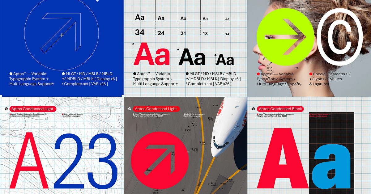
The update hasn’t happened for me yet, so we’ve still got some time to get used to Bierstadt a.k.a. Aptos. It has a curve at the bottom of the lower-case l like Liberation Mono, DejaVu Sans Mono, and Cascadia Code, but without the top serif.
It also takes up more horizontal space than Calibri. I don’t think I like it.
Top is Calibri, bottom is Bierstadt:

Agreed that it’s wider at the same point size. Not sure if it’s easier or harder to read yet, especially that “a”. Seems a little heavier to counter display technology that makes old fonts so thin (and maybe superthin fonts falling out of fashion?). Probably blends better with Chinese, Japanese, and Korean due to being squarer and having shorter descenders, but I don’t trust my eye.