

Now that we have a weekly poll (thanks @g0d0fm15ch13f@lemmy.world for extending that over from the lemmy.world instance), I’d be happy to update our banner weekly with the results.
I made a few mockups in Photoshop with the preseason AP rankings and would like the community’s input. Because web/mobile/app clients display it differently and often superimpose the community icon either in the bottom left or center, the design parameters are kind of tricky.
Option 1:
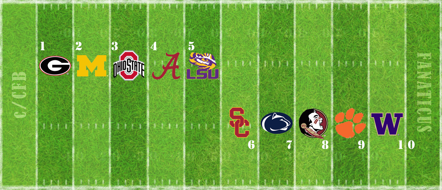
I feel this one balances a clean layout with a fresh look.
Option 2:
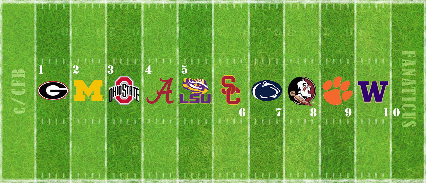
This is the most straightforward, but also most reminiscent of r/cfb. I personally would rather not directly rip off their look, but if a one-to-one replacement is what the community wants, this is the closest.
Option 3:
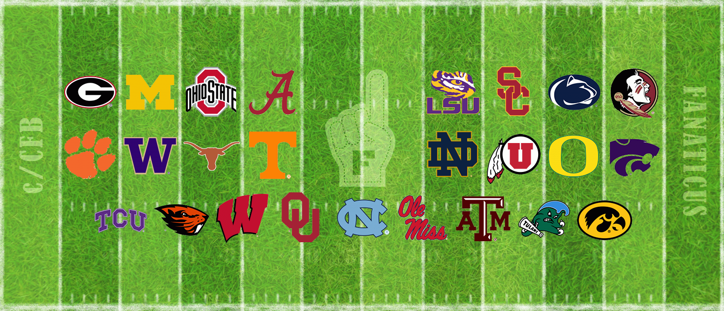
A whole 25 teams gets cluttered, but the result is kind of interesting. Couldn’t really fit the ranking numbers though.
I’m of course open to other suggestions as well. I thought about trying out different end zone ideas, such as the old-school diagonal lines, but kept it simpler for now.
I feel like the end zone is what makes it feel so similar to /r/cfb, not the ranking.
Of these, I think the second option makes the most sense
I wholeheartedly agree with your opinion.
No gettin’ away from its looking like /r/cfb if you’re going to do poll results with logos on a gridiron. I don’t think it was /r/cfb in particular that sent most of us to the Threadiverse anyway. I do like that #1 puts the numbers and logos closer to where yard markers and secondary logos are painted onto real fields.
Maybe tint the end zones or the whole field (ala Boise or Coastal Carolina) in the colors of the #1 or some other team who was newsworthy since the last update.
I would maybe actually vote option 1, but with a super meek voice. I think any of these would be great. And if everybody else wants 2 or 3 I certainly wouldn’t object.
Edit: Also as far as endzones go, maybe that’s the part of the design that we mockup for the #1 team, that way we can have a way to distinguish ourselves from r/cfb
Thanks for the feedback, everyone. I liked the suggestions for the end zones to feature the #1 team, so we’ll try it out. As always, I’m open to suggestions so we can modify the design as the season goes along – just message me or post a comment in the weekly poll threads.